PACKAGING
Every package carries a story a quiet narrative wrapped around glass, paper, and color.
A story of where it comes from, why it exists, and who is meant to pick it up from the shelf.
Good packaging doesn’t just hold a product; it whispers identity, breaks conventions, and invites the right audience to reach for it.
In my work, packaging design becomes a form of storytelling.
A space where tradition and innovation collide, where rules can be rewritten, and where a simple jar, box, or label transforms into an object with purpose something memorable, relatable, and worth choosing.
Whether minimal, bold, nostalgic, or futuristic, each design I create carries its own personality.
Because packaging isn’t just a surface.
It’s the brand’s first conversation with the world.
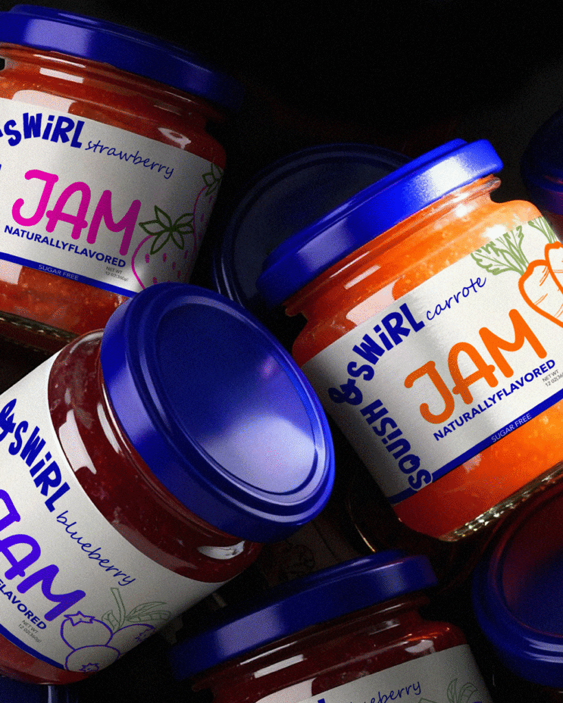
SQUISH & SWIRL
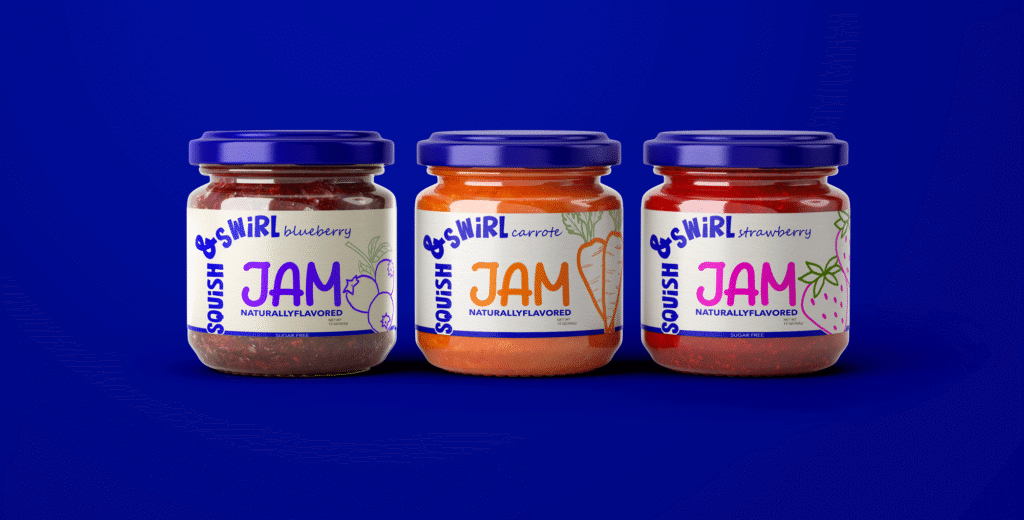
Reinventing Jam for 2026: Bold, Modern, and Beyond the Shelf
For decades, the jam aisle has been visually dominated by one iconic aesthetic: the nostalgic, red-checkered, homemade charm of Bonne Maman a brand that built its entire identity on tradition, comfort, and the classic “grandma’s kitchen” feeling. While this approach shaped the whole category, it also locked jam packaging into a predictable, old-fashioned world.
Squish & Swirl was created to break that pattern.


The Concept:
What would jam look like if it was designed for 2026, not 1976?
What if we challenged every visual cliché of the category colors, fonts, composition and built something unapologetically modern, bold, and unexpected?
Squish & Swirl is a conceptual branding project that flips the script:
Instead of soft, warm, homemade cues, it embraces dark navy tones, sharp contrast, and a layout system that intentionally rejects the familiar grid seen in traditional jam brands. The goal wasn’t just to look different it was to interrupt the shelf, demand attention, and give jam a new visual attitude.
Breaking the Category Codes
Color Palette: While fruit-based products usually lean toward reds, yellows, and sweet pastels, Squish & Swirl uses deep navy blue a color rarely associated with jam, but instantly memorable.
Typography: Instead of vintage serif fonts, the brand uses a modern typographic structure that feels fresh, structured, and edgy.
Composition: The layout intentionally breaks the expected “hand-drawn fruit + handwritten script” formula, creating an identity that feels more like a lifestyle brand than a kitchen product.
The Slogan:
“Not your grandma’s jam, but your grandma on board with it.”
Modern, bold, and unconventional yet still universally loved, from breakfast tables shared by kids to the vibrant grandmas of 2026.
Visual Storytelling
To reinforce the concept visually, the advertising campaign features a playful, energetic grandmother of 2026 confident, stylish, and unexpectedly modern.
These visuals were crafted with the help of AI-generated imagery and refined manually to ensure consistency, character, and visual harmony with the identity.
Why This Project Works
Squish & Swirl redefines what a jam brand can look like.
It pushes beyond conventions and shows how an everyday FMCG product can be transformed through bold art direction and category disruption.
The project aims to inspire fresh thinking in packaging reminding both brands and designers that even a heritage product can feel contemporary when storytelling aligns with visual courage.
 All rights to this concept and its entire branding belong to me. The logo and design may not be used, reproduced, or modified by any third party.
ANDES COFFEE

Andes Coffee is born from the raw, untamed beauty of Ecuador a land where towering mountains meet ancient culture.
This blend takes its name and soul from the legendary Andes mountain range, one of the most iconic geographical symbols of South America.
At a bold intensity level 11, this coffee is crafted for those who want a deep, powerful, full-bodied flavor the kind that feels like standing at the edge of a cliff overlooking the vast Andean world.
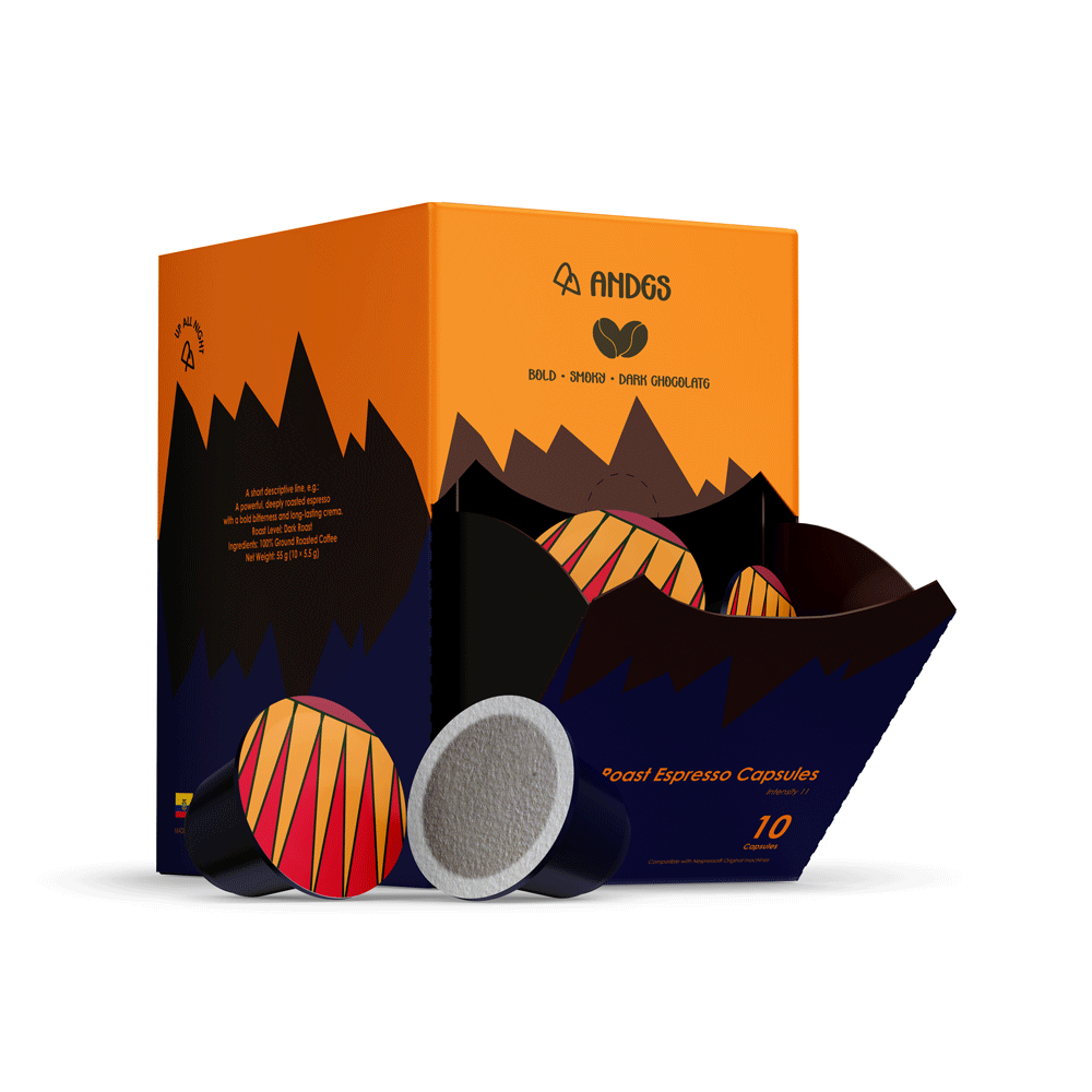
Packaging Concept:
The visual identity is designed as an abstract interpretation of the Andes landscape:
sharp geometric silhouettes, fragmented outlines, and saturated colors that echo the dramatic peaks, volcanic formations, and the windswept plateaus of Ecuador.
The artwork on the packaging captures an imaginary scene almost like a graphic postcard taken from a surreal version of the Andes.
Nothing is literal; everything is emotion and intensity, just like the coffee itself.
Ecuadorian Cultural Touch
The caps of the coffee capsules feature patterns inspired by traditional Ecuadorian crafts bold colors, rhythmic lines, and vibrant textures seen in indigenous textiles and handwoven art.
These small details ground the modern abstract visuals in authentic cultural roots.
Quilotoa Lake Reference:
Hints of shapes and gradients within the design are drawn from the serene yet powerful appearance of Quilotoa Lake, a volcanic crater lake famous for its shifting turquoise tones.
This subtle reference anchors the product unmistakably to Ecuador.
Overall Design Philosophy:
Everything from color to composition is intentionally intense, reflecting the strength of the blend itself.
The entire packaging feels like a story told through abstraction, where culture, landscape, and flavor merge into one expressive identity.
All rights to this concept and its entire branding belong to me. The logo and design may not be used, reproduced, or modified by any third party.
FAMOR
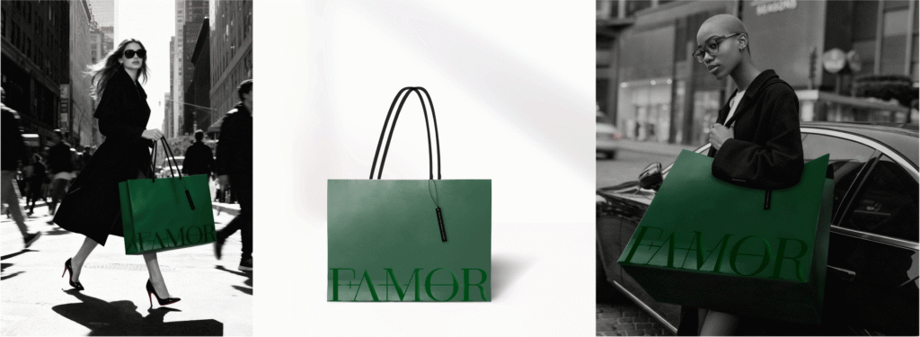
Femore is a multi-brand fashion label designed for powerful, independent, and professional women those who want their fashion choices, from lingerie to everyday casual, to come together in a single, seamless, high-quality shopping experience.
To create a tangible and functional experience, the packaging and identity design for Femore was built on performance, aesthetics, and a sense of empowerment. The shopping bag was designed oversized to accommodate multiple items without losing its shape perfectly aligned with the lifestyle of the brand’s customers.
Long handles, a sturdy structure, and high-quality cardboard were carefully selected to ensure comfort while carrying, while conveying the luxurious feel of a premium fashion brand. The brand logo is applied with foil stamping at the bottom of the bag, presenting Femor’s identity as clean, minimal, yet bold.
A special tag was also designed for product hangers, featuring the brand’s slogan a small but impactful touch that reinforces Femor’s identity at every point of the shopping experience.
The result? Packaging that is exactly like the women it was made for: strong, stylish, functional, and effortlessly confident.