BRANDING
From my perspective, every brand carries a story.
In branding, this story is essential it has a beginning, a rise, and moments of transformation.
But unlike a book, it never truly ends. A brand’s story keeps evolving,
shaped by emotion, creativity, and connection.
A powerful brand should have rhythm its own highs and lows,
moments of surprise and depth because that’s what keeps it alive, memorable, and real.
KHAL'AT
Problem:
Years ago, when a foreign friend of mine visited Iran, she was deeply fascinated by Persian craftsmanship handwoven carpets, embroidered fabrics, calligraphy, and pottery.
But despite her excitement, she struggled to find a trustworthy and curated place to purchase these authentic pieces. That memory stayed with me, and later became the seed of an idea.
Solution:
“Khal’at” was born from the desire to bridge that gap a conceptual brand that reimagines Persian artistry for a modern audience.
It’s designed as a digital platform where visitors, travelers, and collectors can explore the depth of Iranian culture through its handmade creations.
The logo and visual identity are inspired by traditional Persian architecture deep blue tiles, beige brickwork, and the vibrant red found in classic Persian rugs combining heritage with elegance and modernity.
The shape of the logo itself draws from decorative motifs used in Persian architectural ornamentation, symbolizing the harmony between tradition and contemporary design.
⚠️ All rights to this concept and its entire branding belong to me.The logo and design may not be used, reproduced, or modified by any third party.
⚠️ The music used in this video belongs to its original composer.It is featured here for conceptual and non-commercial presentation purposes only.
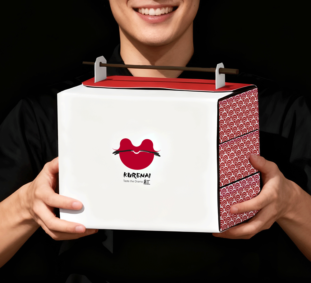
KURENAI
Kurenai is a luxurious Japanese restaurant that celebrates the elegance of traditional cuisine and authentic Japanese beverages.
In my branding approach, authenticity and origin have always been at the heart of my work. I strive to ensure that every element from the smallest details to the overall atmosphere aligns seamlessly with the brand’s essence and cultural roots. For me, true branding is not just about visuals; it’s about creating an experience that feels genuine and deeply connected to the story behind it.
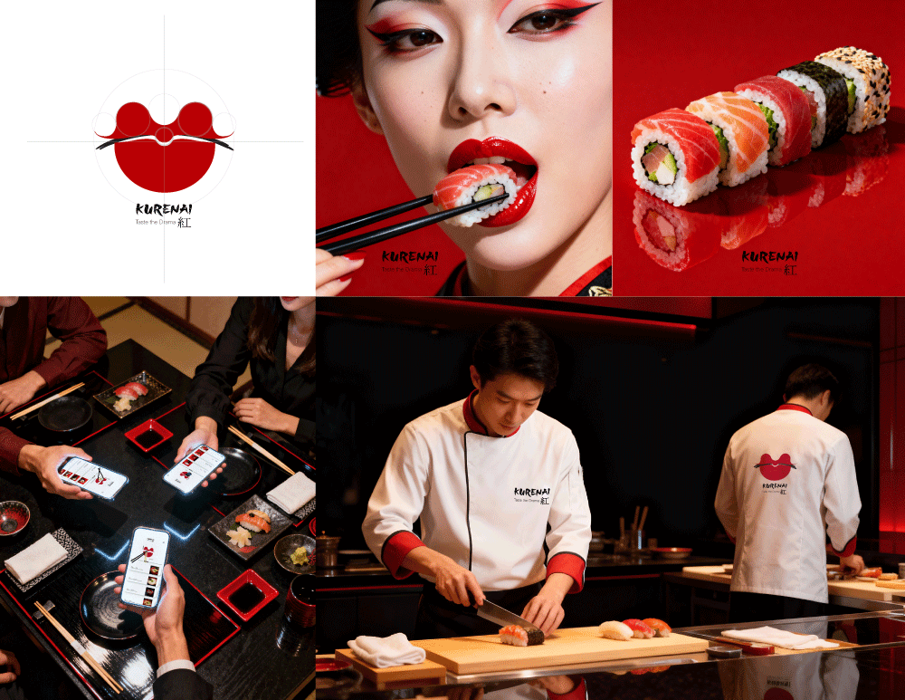
Kurenai means “deep red” in Japanese a color that symbolizes passion, strength, and tradition. For this reason, I chose a circular shape inspired by sushi rolls and the red hue that appears both at the center of Japan’s national flag and within the name itself.
To maintain a fully cohesive visual language, I crafted every element of this project from scratch from the chef’s uniform and the menu system to the take-out packaging. Each piece carries the same minimal Japanese aesthetic and references the bold theatricality of Kabuki, creating a unified brand world that feels intentional, immersive, and unmistakably Kurenai
I’ve always been fascinated by the elegance of Japanese minimal design its balance, purity, and quiet strength. To bring an artistic touch to the Kurenai branding, I drew inspiration from the iconic red lips of Kabuki makeup and the striking contrast of Japan’s national flag the white and crimson tones that reflect simplicity, passion, and grace.
⚠️ All rights to this concept and its entire branding belong to me.The logo and design may not be used, reproduced, or modified by any third party.
PINO
PINO is a café-inspired FMCG brand that celebrates wellness, simplicity, and sustainability.
It offers a curated range of fresh juices, organic snacks, and healthy meals made for people who care about balance and mindful living.
The brand identity draws from the harmony between nature and urban life, using a deep green palette combined with
white and soft tones to reflect freshness and calmness.
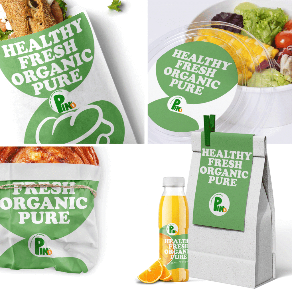
Packaging materials are thoughtfully selected to emphasize the brand’s sustainable mindset, balancing practicality with eco-awareness.
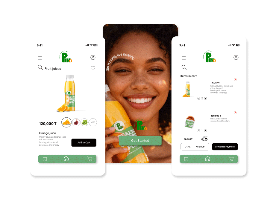
Beyond its physical products, PINO extends into the digital world through its mobile app, connecting customers with real-time menu updates, a loyalty system, and a seamless ordering experience.
Together, these elements create an integrated ecosystem where design, technology, and well-being come together defining PINO as more than a brand, but a lifestyle.
⚠️ All rights to this concept and its entire branding belong to me.The logo and design may not be used, reproduced, or modified by any third party.